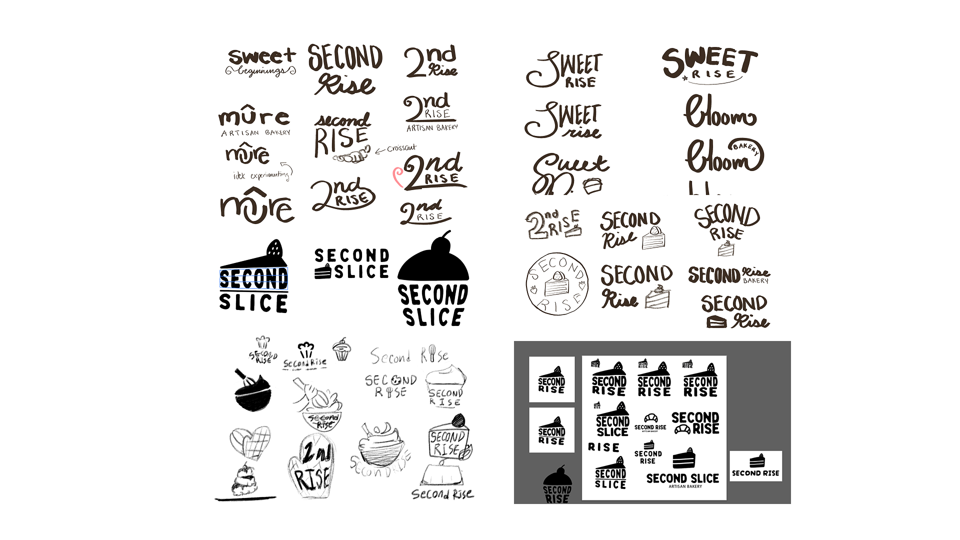
Logo Process
First started off with lots of different names, but settled with Second Slice, with shapes resembling a slice of cake.
Logo Process
This was the initial attempt with the logo, a slice of cake shape to showcase the what this space is for. But the perspective and type for “slice” seemed a little off.
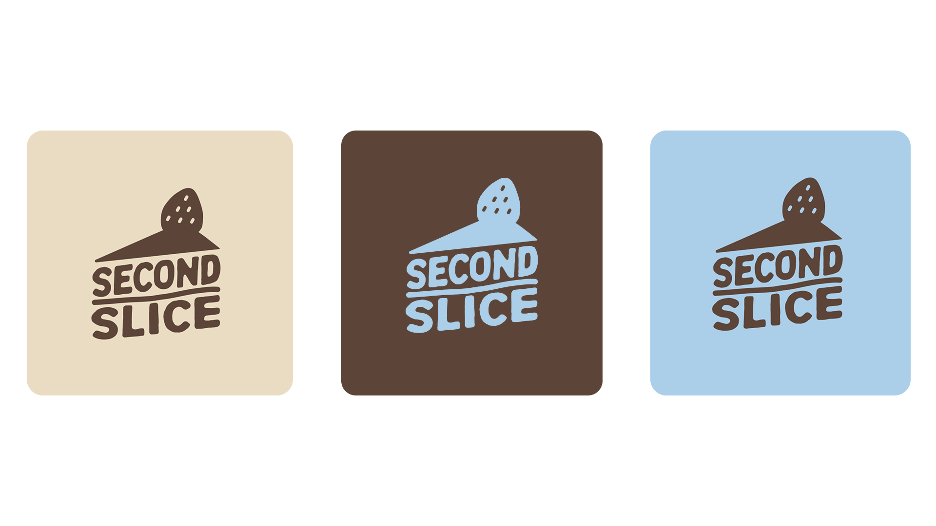
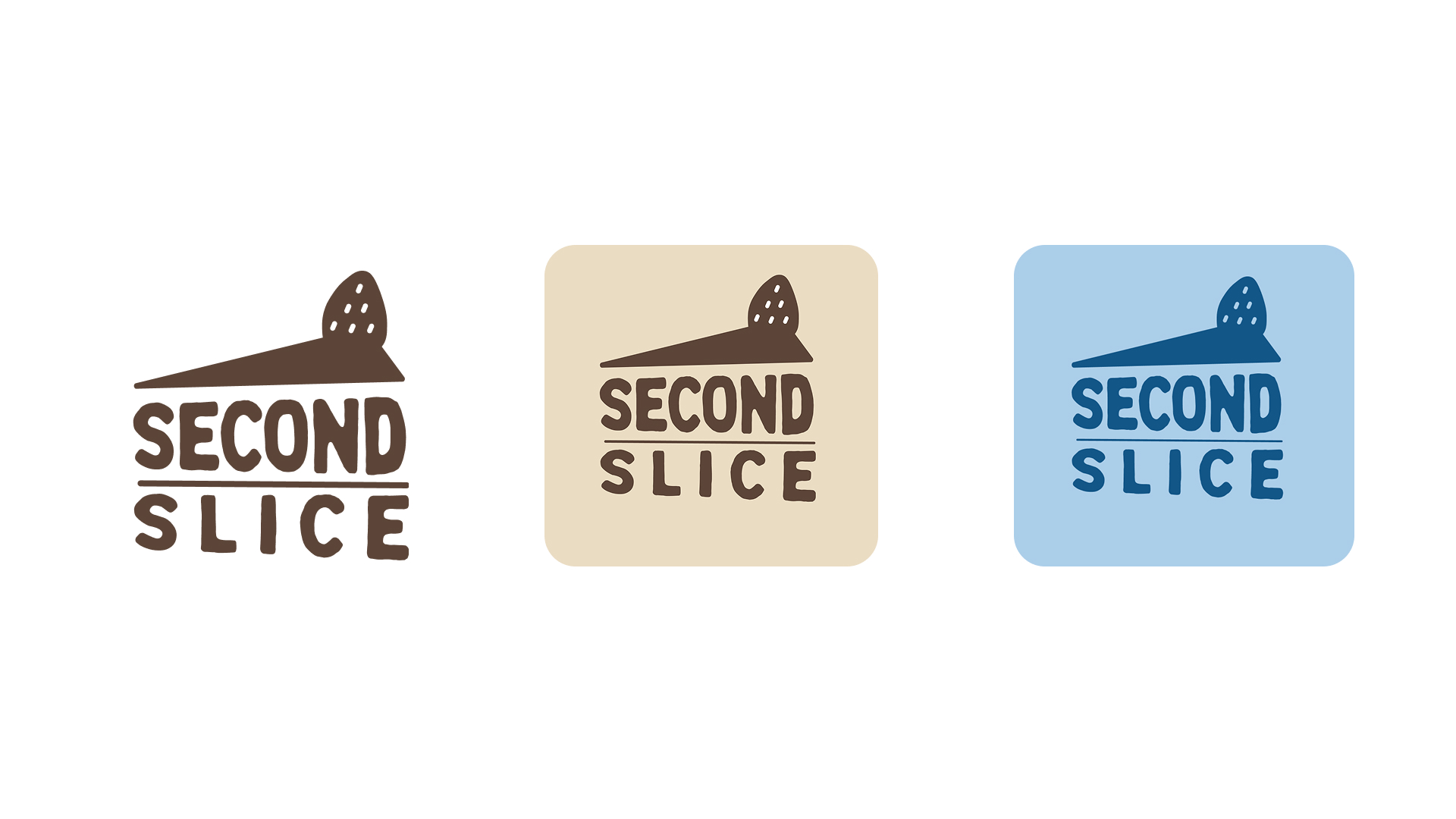
Logo Process
Final logo have revised perspective and typeface
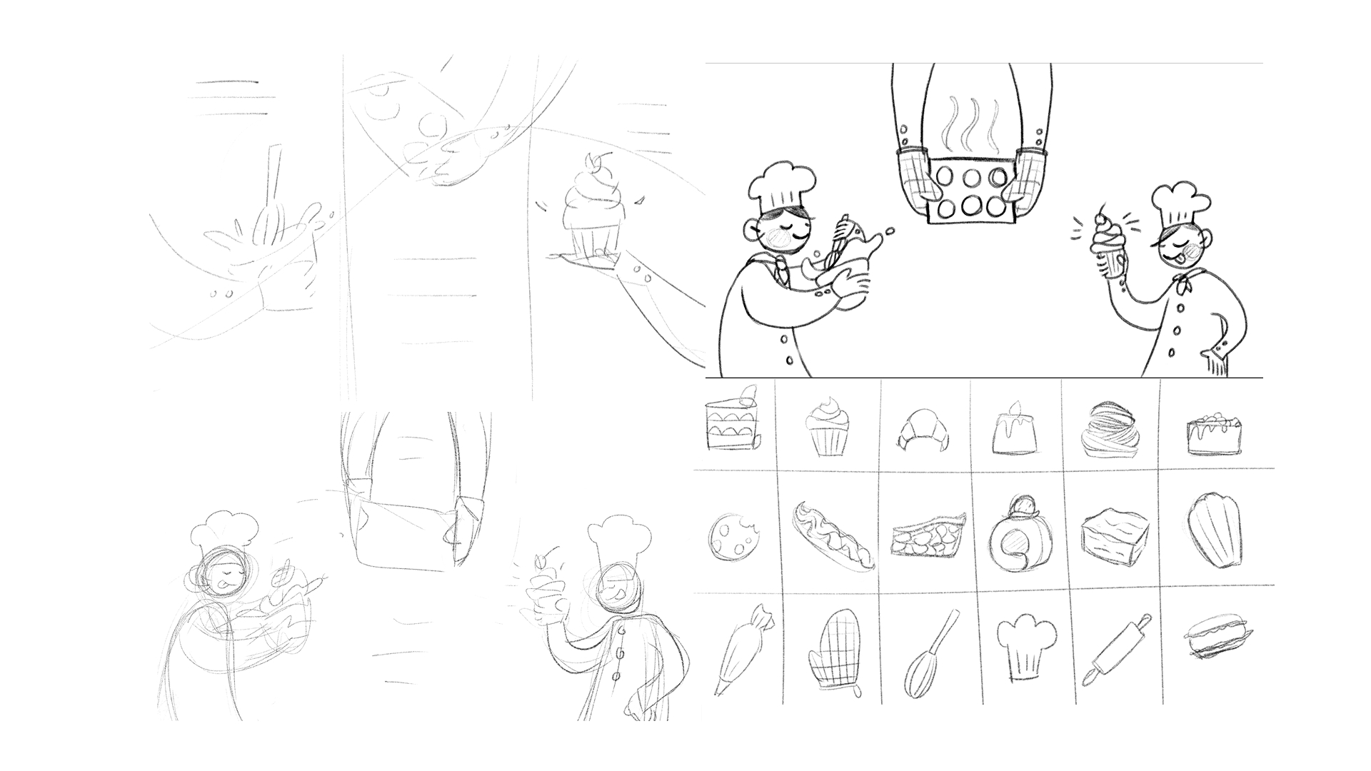
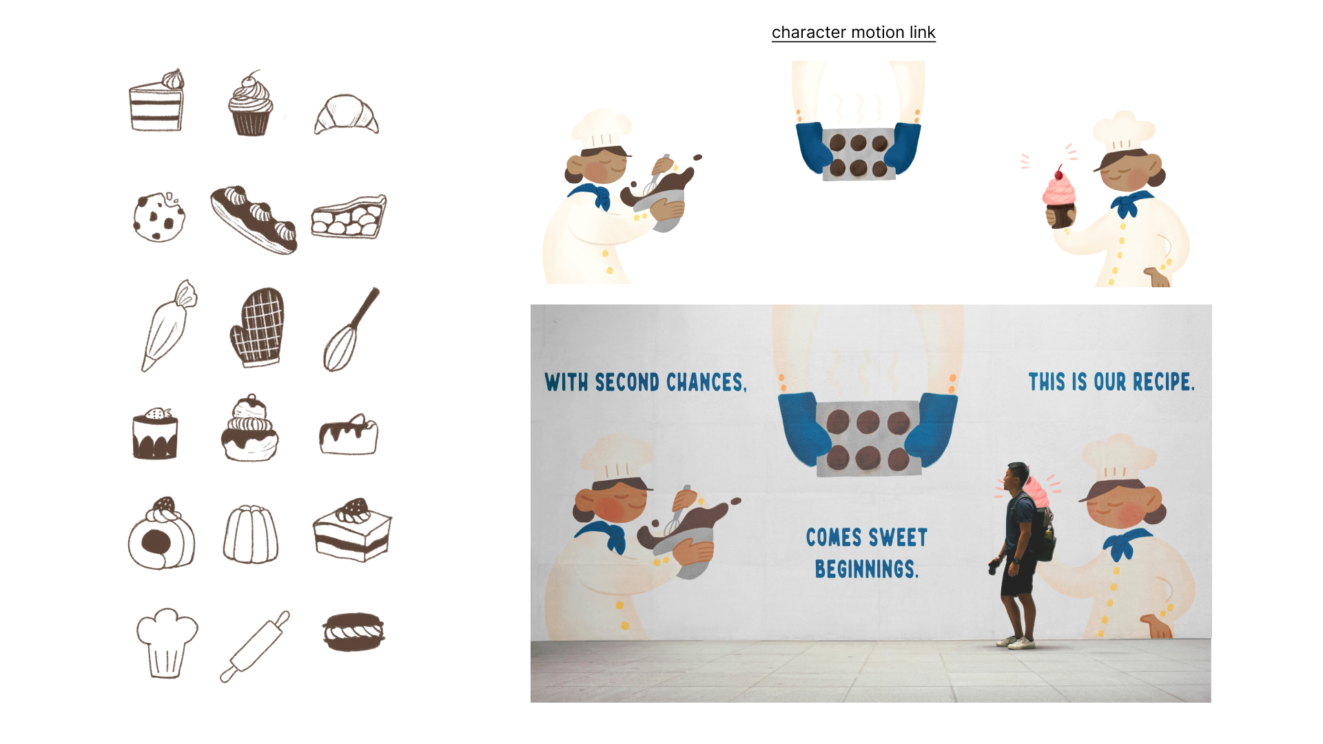
Sketching Process
Initially, the visuals started as simple sketches of hands. However, after receiving feedback from peers, it became clear that creating a full character would be more impactful. This shift helped build a stronger emotional connection to the program and made the mural more engaging.
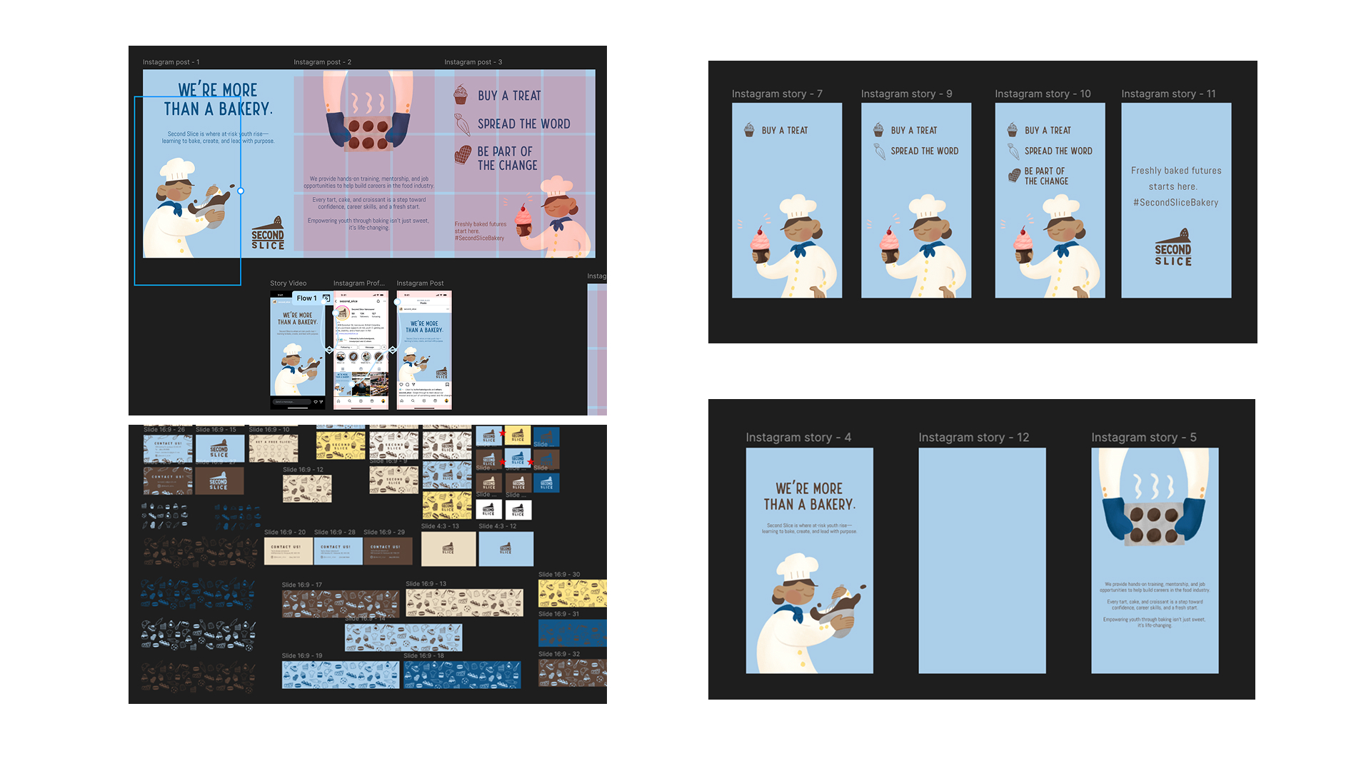
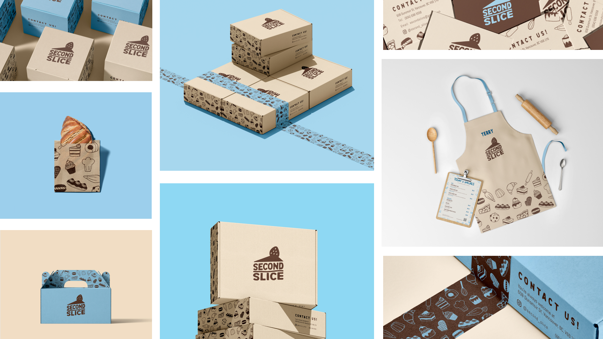
Developing Process
As for the logo and pattern work, it was a longer, more meticulous process. Choosing the right colours and positioning them thoughtfully took time to ensure the design felt balanced and didn’t overwhelm the packaging or other collateral materials.